

Enhancing Library’s Discoverability
Duration: August 7th-18th 2023
Team: Myself, Eileen Calub
Responsibilities: UX/UI Design
Tools: Figma, FigJam, Google Docs
My Role
As a UX/UI Designer helping Breshna with this project, I played a critical role in redesigning Breshna's video game library. Joining the project at a later stage, I swiftly adapted to the project's objectives, identified key problems, conducted competitive analysis, and contributed high-fidelity wireframes to drive the project forward.
Background
Breshna constitutes a no-code game development framework adeptly employed to give the capability to its users to craft games intended for diverse objectives encompassing education, training, and marketing initiatives.
Problems
Users face challenges finding the library and locating specific types of games within it, leading to difficulties in selecting desired games.
Goals
With Breshna’s ability to help developers create games quickly, the library becomes diverse and expansive. Since there is an extensive collection of video games, we want to create a flow that makes it easier for players to find the precise games they want. I also want to help make the library easier to discover.
User Research
Speaking with the Founder and COS of Breshna, we became aware that the website is still in development and that the current library needed a redesign.
What we Learned
Main Users: Educators (teachers, parents)
Breshna Games’ Focus: Education, Entertainment, Enterprise, Social Impact
User Pain Points
Lack of a library to browse and discover games
No way to filter and sort games
Main Objective
Design a game library that organizes the games in an engaging and intuitive way.
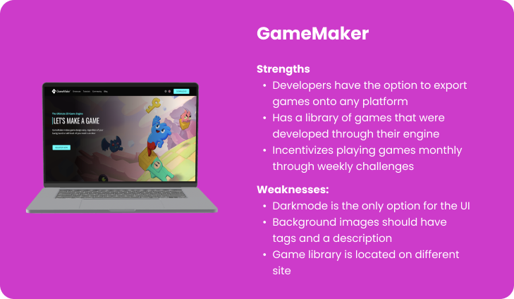
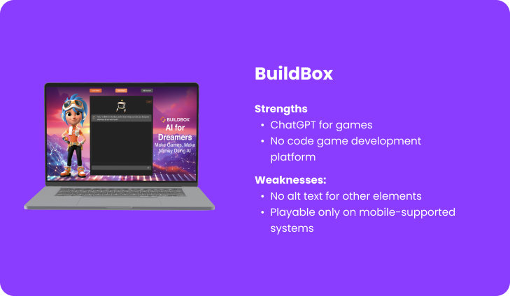
Competitive Analyses
After conversing with Breshna and identifying the user experience challenges users encountered, we conducted several competitive analyses to gain insights into prevalent design patterns and user journeys among analogous websites. Our primary focus was on platforms centered around video games, emphasizing fostering a community-driven approach to game creation and sales.


Navigation
Since we’re working on the library, I wanted to ensure that visitors who would like to play a game or gain inspiration would be immediately aware of Breshna’s expansive library. Currently, the user will have to scroll down to become aware.


Solution: Make the Library More Visible
Adding a CTA to the navigation bar lets new and old end-users know that viewing the currently available games is an option.
I would suggest sticking the navigation bar to the top while scrolling so it’s always available for the user. Since the homepage is lengthy, I recommend sticking an arrow to the bottom-right of the page to help the user quickly traverse back to the top.

Before

After

Category Card
When the player reaches the category cards on the home page, the design of the cards might make it hard to interact with them.

“View All” CTA is too Small
Being that the View All Call-To-Action (CTA) is small, it can create a pain point when the end-user is trying to click on it.Arrows Aren’t in Proximity of Carousel
The arrows could be viewed as not being grouped with the carousel and doesn’t follow common carousel design patternsColor Pallet Doesn’t Contrast Well
The carousel colors don’t contrast well with the two colors similar to the background. This will be difficult for users who are color blind.
Solution: Visibility and Grouping
Fitt’s Law
Ensure that your CTA buttons are large so users can easily click and select them.Proximity
People understand things better when related elements are visually organized.Contrast
To help with accessibility, colors are required to create a visual hierarchy making differentiating elements more recognizable.

Library
The games in the library lack context before playing, only providing a name and the option to add to a wishlist. In our conversations with Breshna, we discovered the elements they wish to include:
Categories
Filters
Lists of recommendations
Lo-Fi Wireframes

Iteration
Once we presented our wireframes to Breshna, we were told they enjoyed the elements. However, they wished the navigation bar to be located on the left side. We were given an example of a WIP screen and iterated on our current work.
Breshna’s example

Latest Lo-Fi Iteration

Components
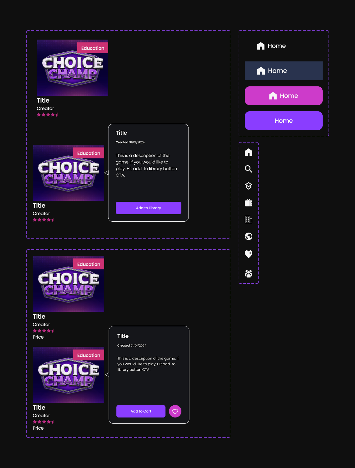
Hi-Fi Wireframes


Before
After
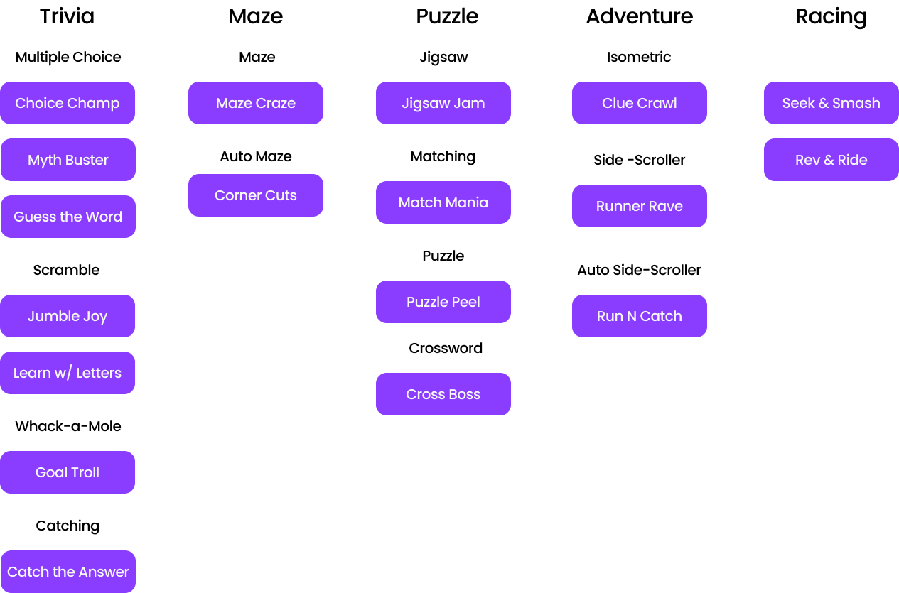
Additional Filters
Breshna provides users with 18 game templates that can be used to create their games. Knowing that, I made another set of filters based on the existing templates.

Suggestion: Categorize Templates by Familiar Genres
Within the 18 templates, there are various games that fit into genres known to people who are familiar with different types of games, such as board games and video games.
For example: Puzzles


Ideas for Genres & Filters*
*Card Sorting Recommended
Testimonial

In Conclusion
What else would I have liked to work on during the project?
Being that this was a sprint, I decided to use a Figma plug-in for the icons. Had I have more time, I would have created our own with active, inactive, and hover states. Doing so, I believe could clean up the UI to be more suttle but still keep the user aware of their current location.
I would also love to take part in user testing to gain data to back the redesigns, but testing won’t be possible for a while.